Visualizing distributions
Fairlens supports tools to visualize the distribution of sensitive groups relative to one another.
First we will import the required packages and load the compas dataset.
Note
FairLens ships with a custom style which can be used. You can be activate this using fairlens.plot.use_style,
or reset to the defaults using fairlens.plot.reset_style. Note that using these styles may override your
systems default parameters. This may prove useful if text in plots is misaligned or too large.
In [1]: import pandas as pd

In [2]: import fairlens as fl

In [3]: fl.plot.use_style()

In [4]: df = pd.read_csv("../datasets/compas.csv")

In [5]: df.info()
<class 'pandas.core.frame.DataFrame'>
RangeIndex: 20281 entries, 0 to 20280
Data columns (total 22 columns):
 #   Column                   Non-Null Count  Dtype
---  ------                   --------------  -----
 0   PersonID                 20281 non-null  int64
 1   AssessmentID             20281 non-null  int64
 2   CaseID                   20281 non-null  int64
 3   Agency                   20281 non-null  object
 4   LastName                 20281 non-null  object
 5   FirstName                20281 non-null  object
 6   MiddleName               5216 non-null   object
 7   Sex                      20281 non-null  object
 8   Ethnicity                20281 non-null  object
 9   DateOfBirth              20281 non-null  object
 10  ScaleSet                 20281 non-null  object
 11  AssessmentReason         20281 non-null  object
 12  Language                 20281 non-null  object
 13  LegalStatus              20281 non-null  object
 14  CustodyStatus            20281 non-null  object
 15  MaritalStatus            20281 non-null  object
 16  ScreeningDate            20281 non-null  object
 17  RecSupervisionLevelText  20281 non-null  object
 18  RawScore                 20281 non-null  float64
 19  DecileScore              20281 non-null  int64
 20  ScoreText                20245 non-null  object
 21  AssessmentType           20281 non-null  object
dtypes: float64(1), int64(4), object(17)
memory usage: 3.4+ MB
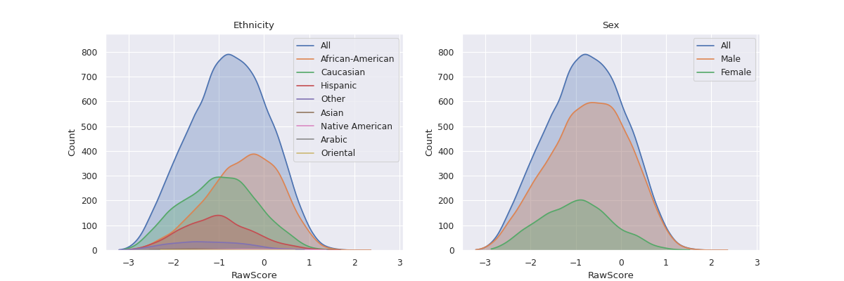
Distribution of Groups
Visualizing the distribution of a variable in 2 distinct sub-groups can help us understand if the
variable is skewed in the direction of either of the sub-groups. For instance in the COMPAS dataset,
this can help in showing whether the distribution of raw COMPAS scores is skewed in the favor of
Caucasian Males as compared to African-American Males.
The method fairlens.plot.distr_plot can be used to visualize the distributions of these groups.
In [6]: import matplotlib.pyplot as plt

In [7]: target_attr = "RawScore"

In [8]: group1 = {"Sex": ["Male"], "Ethnicity": ["Caucasian"]}

In [9]: group2 = {"Sex": ["Male"], "Ethnicity": ["African-American"]}

In [10]: fl.plot.distr_plot(df, target_attr, [group1, group2])
Out[10]: <AxesSubplot:xlabel='RawScore', ylabel='Count'>
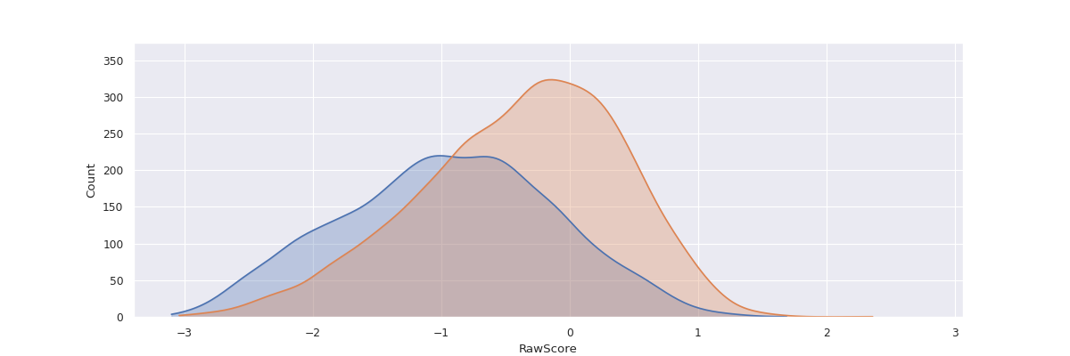
By default, this method plots a Kernel Density Estimator over the raw data, however it can be configured to plot histograms instead. See the API-Reference for more details.
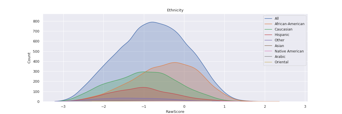
Distribution of Groups in a Column
It can be insightful to visualize the distribution of a variable with respect to all
the unique sub-groups of data in a column.
For instance, visualizing the distribution of raw scores in the COMPAS dataset with respect
to all Ethnicities may help us understand the relationship between Ethnicity and raw scores.
The method fairlens.plot.attr_distr_plot can be used for this.
In [11]: target_attr = "RawScore"

In [12]: sensitive_attr = "Ethnicity"

In [13]: fl.plot.attr_distr_plot(df, target_attr, sensitive_attr)
Additionally, this can be extended to plot the distribution of raw scores with respect to
a list of sensitive attributes using fairlens.plot.mult_distr_plot. This can be
used give a rough overview of the relationship between all sensitive attributes and a
target variable.
In [14]: target_attr = "RawScore"

In [15]: sensitive_attrs = ["Ethnicity", "Sex"]

In [16]: fl.plot.mult_distr_plot(df, target_attr, sensitive_attrs)