fairlens.plot.attr_distr_plot#
- attr_distr_plot(df, target_attr, attr, distr_type=None, attr_distr_type=None, max_quantiles=8, separate=False, show_hist=None, show_curve=None, shade=True, normalize=False, cmap=None, ax=None)[source]#
Plot the distribution of the target attribute with respect to all the unique values in the column attr.
- Parameters
df (pd.DataFrame) – The input dataframe.
target_attr (str) – The target attribute.
attr (str) – The attribute whose values’ distributions are to be plotted.
distr_type (Optional[str], optional) – The type of distribution of the target attribute. Can take values from [“categorical”, “continuous”, “binary”, “datetime”]. If None, the type of distribution is inferred based on the data in the column. Defaults to None.
attr_distr_type (Optional[str], optional) – The type of distribution of attr. Can be “categorical”, “continuous” or “datetime”. If None the type of distribution is inferred based on the data in the column. Defaults to None.
max_quantiles (int, optional) – The maximum amount of quantiles to use for continuous data. Defaults to 8.
separate (bool, optional) – Separate into multiple plots (subplot). Defaults to False.
show_hist (Optional[bool], optional) – Shows the histogram if True. Defaults to True if the data is categorical or binary.
show_curve (Optional[bool], optional) – Shows a KDE if True. Defaults to True if the data is continuous or a date.
shade (bool, optional) – Shades the curve if True. Defaults to True.
normalize (bool, optional) – Normalizes the counts so the sum of the bar heights is 1. Defaults to False.
cmap (Optional[Sequence[Tuple[float, float, float]]], optional) – A sequence of RGB tuples used to colour the histograms. If None seaborn’s default pallete will be used. Defaults to None.
ax (Optional[matplotlib.axes.Axes], optional) – An axis to plot the figure on. Defaults to plt.gca(). Defaults to None.
- Returns
The matplotlib axes containing the plot if separate is False, otherwise None.
- Return type
Optional[matplotlib.axes.Axes]
Examples
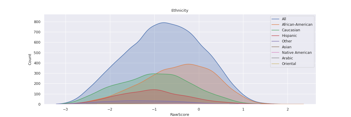
>>> df = pd.read_csv("datasets/compas.csv")
>>> attr_distr_plot(df, "RawScore", "Ethnicity")
>>> plt.show()