fairlens.plot.distr_plot#
- distr_plot(df, target_attr, groups, distr_type=None, show_hist=None, show_curve=None, shade=True, normalize=False, cmap=None, ax=None)[source]#
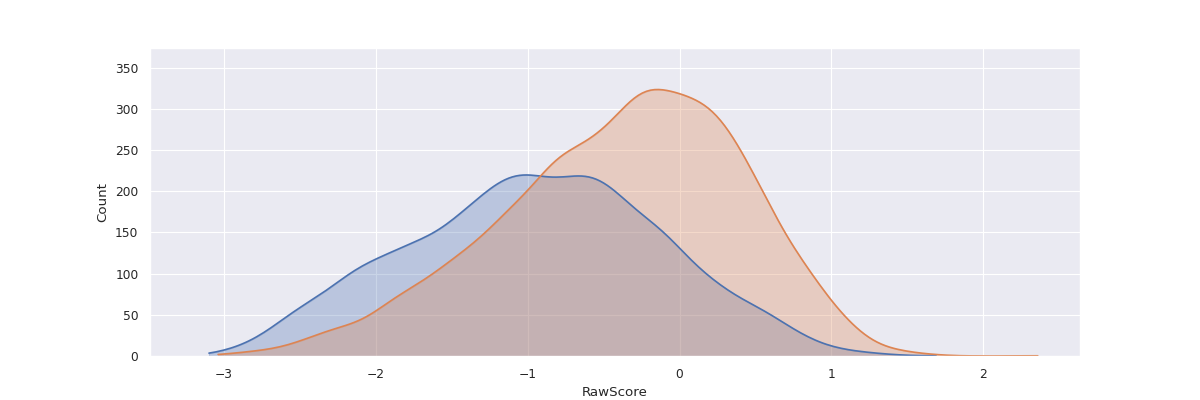
Plot the distribution of the groups with respect to the target attribute.
- Parameters
df (pd.DataFrame) – The input dataframe.
target_attr (str) – The target attribute.
groups (Sequence[Union[Mapping[str, List[Any]], pd.Series]]) – A list of groups of interest. Each group can be a mapping / dict from attribute to value or a predicate itself, i.e. pandas series consisting of bools which can be used as a predicate to index a subgroup from the dataframe. Examples: {“Sex”: [“Male”]}, df[“Sex”] == “Female”
distr_type (Optional[str]) – The type of distribution of the target attribute. Can take values from [“categorical”, “continuous”, “binary”, “datetime”]. If None, the type of distribution is inferred based on the data in the column. Defaults to None.
show_hist (Optional[bool], optional) – Shows the histogram if True. Defaults to True if the data is categorical or binary.
show_curve (Optional[bool], optional) – Shows a KDE if True. Defaults to True if the data is continuous or a date.
shade (bool, optional) – Shades the curve if True. Defaults to True.
normalize (bool, optional) – Normalizes the counts so the sum of the bar heights is 1. Defaults to False.
cmap (Optional[Sequence[Tuple[float, float, float]]], optional) – A sequence of RGB tuples used to colour the histograms. If None seaborn’s default pallete will be used. Defaults to None.
ax (Optional[matplotlib.axes.Axes], optional) – An axis to plot the figure on. Defaults to plt.gca(). Defaults to None.
- Returns
The matplotlib axis containing the plot.
- Return type
matplotlib.axes.Axes
Examples
>>> df = pd.read_csv("datasets/compas.csv")
>>> g1 = {"Ethnicity": ["African-American"]}
>>> g2 = {"Ethnicity": ["Caucasian"]}
>>> distr_plot(df, "RawScore", [g1, g2])
>>> plt.show()