Hidden Correlations#
Fairlens offers a range of correlation metrics that analyze associations between two numerical series, two categorical series or between categorical and numerical ones. These metrics are used both to generate correlation heatmaps of datasets to provide a general overview and to detect columns that act as proxies for the sensitive attributes of datasets, which pose the risk of training biased models.
Sensitive Proxy Detection#
In some datasets, it is possible that some apparently insensitive attributes are correlated highly enough with a sensitive column that they effectively become proxies for them and posing the danger to make a biased machine learning model if the dataset is used for training.
As such, the sensitive package provides utilities for scanning dataframes and detecting insensitive columns
that are correlated with a protected category. For a dataframe, a user can choose to scan the whole dataframe
and its columns or to provide an exterior Pandas series of interest that will be tested against the sensitive
columns of the data.
In a similar fashion to the detection function, users have the possibility to provide their own custom string distance function and a threshold, as well as specify the correlation cutoff, which is a number representing the minimum correlation coefficient needed to consider two columns to be correlated.
Let’s first look at how we would go about detecting correlations inside a dataframe:
In [1]: import pandas as pd

In [2]: import fairlens as fl

In [3]: columns = ["gender", "random", "score"]

In [4]: data = [["male", 10, 50], ["female", 20, 80], ["male", 20, 60], ["female", 10, 90]]

In [5]: df = pd.DataFrame(data, columns=columns)
Here the score seems to be correlated with gender, with females leaning towards somewhat higher scores. This is picked up by the function, specifying both the insensitive and sensitive columns, as well as the protected category of the sensitive one:
In [6]: fl.sensitive.find_sensitive_correlations(df)
Out[6]: {}
In this example, the two scores are both correlated with sensitive columns, the first one with gender and the second with nationality:
In [7]: col_names = ["gender", "nationality", "random", "corr1", "corr2"]

In [8]: data = [
   ...:     ["woman", "spanish", 715, 10, 20],
   ...:     ["man", "spanish", 1008, 20, 20],
   ...:     ["man", "french", 932, 20, 10],
   ...:     ["woman", "french", 1300, 10, 10],
   ...: ]
   ...:

In [9]: df = pd.DataFrame(data, columns=col_names)

In [10]: fl.sensitive.find_sensitive_correlations(df)
Out[10]: {'corr1': [('gender', 'Gender')], 'corr2': [('nationality', 'Nationality')]}
Correlation Heatmaps#
The plot module allows users to generate a correlation heatmap of any dataset by simply
passing the dataframe to the two_column_heatmap() function, which will plot a heatmap from the
matrix of the correlation coefficients computed by using the Pearson Coefficient, the Kruskal-Wallis
Test and Cramer’s V between each two of the columns (for numerical-numerical, categorical-numerical and
categorical-categorical associations, respectively).
To offer the possibility for extensibility, users are allowed to provide some or all of the correlation metrics themselves instead of just using the defaults.
Note
The fairlens.metrics package provides a number of correlation metrics for any type of association.
Alternatively, users can opt to implement their own metrics provided that they have two pandas.Series
objects as input and return a float that will be used as the correlation coefficient in the heatmap.
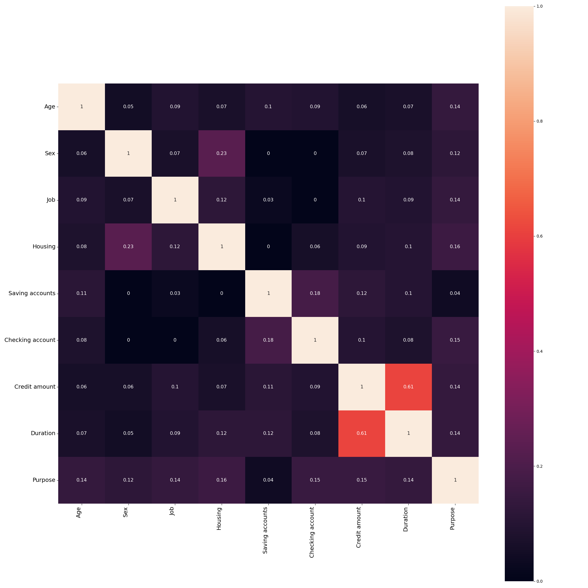
Let’s look at an example by generating a correlation heatmap using the COMPAS dataset. First, we will load the data and check what columns in contains.
In [11]: df = pd.read_csv("../datasets/german_credit_data.csv")

In [12]: df
Out[12]:
     Age     Sex  Job  ... Credit amount Duration              Purpose
0     67    male    2  ...          1169        6             radio/TV
1     22  female    2  ...          5951       48             radio/TV
2     49    male    1  ...          2096       12            education
3     45    male    2  ...          7882       42  furniture/equipment
4     53    male    2  ...          4870       24                  car
..   ...     ...  ...  ...           ...      ...                  ...
995   31  female    1  ...          1736       12  furniture/equipment
996   40    male    3  ...          3857       30                  car
997   38    male    2  ...           804       12             radio/TV
998   23    male    2  ...          1845       45             radio/TV
999   27    male    2  ...          4576       45                  car

[1000 rows x 9 columns]
We can generate a correlation heatmap to get a rough idea of any potentially hidden correlations. This will automatically choose different methods for different types of data, however, these are configurable.
In [13]: fl.plot.two_column_heatmap(df)
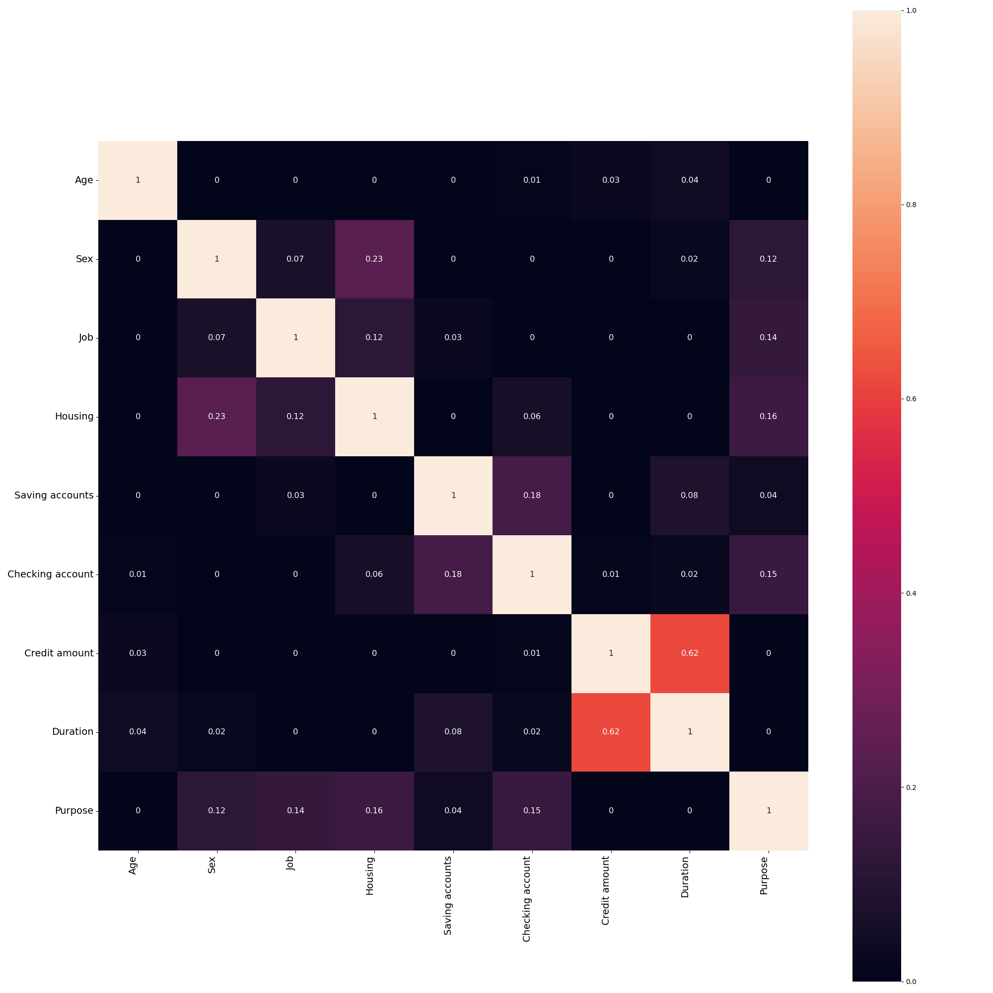
Let’s try generating a heatmap of the same dataset, but using some non-linear metrics for numerical-numerical and numerical-categorical associations for added precision.
In [14]: from fairlens.metrics import distance_nn_correlation, distance_cn_correlation, cramers_v

In [15]: fl.plot.two_column_heatmap(df, distance_nn_correlation, distance_cn_correlation, cramers_v)